Making a Pattern – International Dog Day 2019

Happy International Dog Day 2019! Here’s a rather dramatic Tibetan Spaniel keep an eye on things.

Hej hej!

It’s been a while but so much has gone on in the background of my life, but I guess that’s for another day. I thought I would finally make a walk-through of pretty much the only thing people ask me about.

~ How to make a pattern! ~

I will preface this with saying that I have deliberately saved these out as low quality jpegs as I deal with art-theft with my patterns a lot. Secondly, this is an exceptionally lazy pattern even for me.

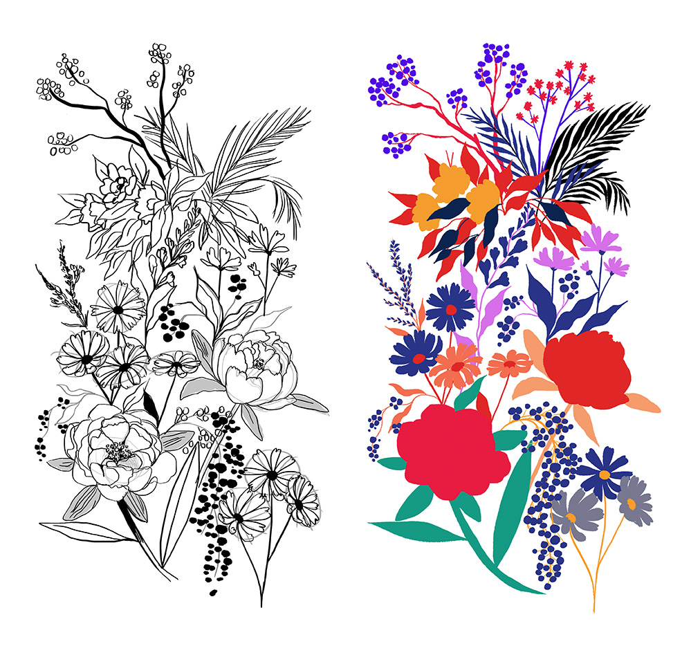
Ok first things, it’s important to have a basis for your pattern for what you want. In this case, I knew that I wanted a pattern which is super moody and heavy in florals. This was my original sketch, and also the rough block in of the plants.

Depending on the complexity of your pattern I suggest making at least 3 or more components to play around with. In this case this one is made up of 14 groups of flowers.

So, colour them up, choose a background colour and make a choice! You can either treat your compenants as seperate layers that you can drop in where you want, or you can be lazy like me and treat your piece as a block.

Since I was treating mine as a block it needed to look nice and full as a stand alone piece. In the circles you can see where I added in more leaves and flowers to make it feel more full.

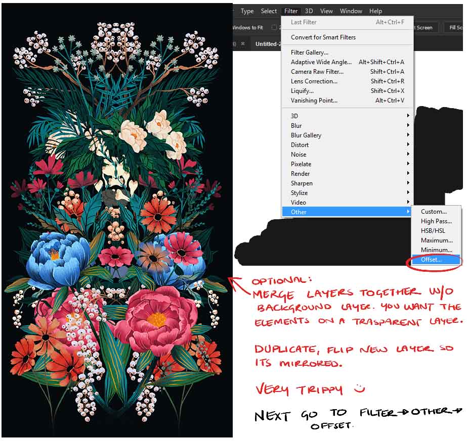
Ok, now that I’m happy with this, I went along and merged the layer down as a transparent layer.

*** It’s important to keep your items completely separate from the background! Also everything MUST fit inside the canvas. ***

In this case I duplicated my piece and flipped it. It’s a lazy way of making there feel like there’s more variation than there is. If you’re working piece by piece then I suggest to keep copies of your seperate pieces and and merge a block of an area you’re happy with. Build little blocks of composition to play with.

Cool, time to play with pattern making! Go to your toolbar -> Other -> Offset.

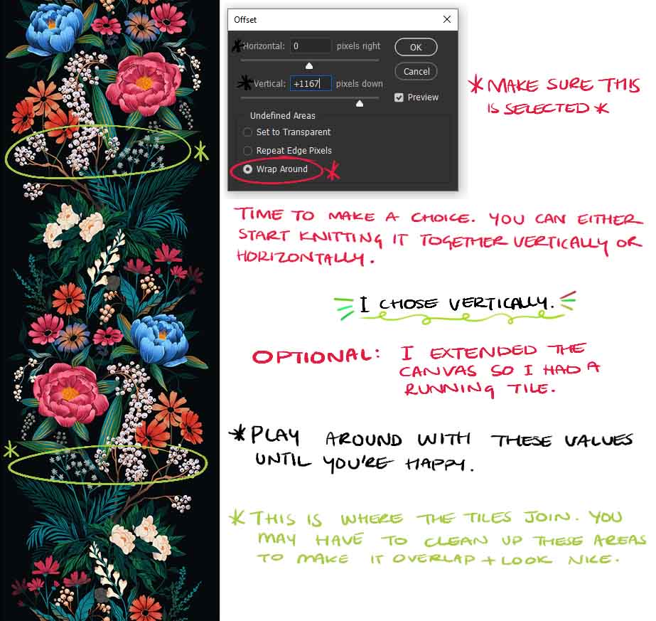
You should see a lil window pop up! Make sure to click “Wrap Around” and time to play with the pixels. Sometimes I play with Horizontal and Vertical at the same time, but this time I decided to work with vertical only.

Since I knew I was going to build my piece vertically I extended the canvas by another 80% so there’s enough room for everything.

I then messed around until I was happy with how it overlapped. I then erased areas and copy-pasted areas so that it looked neat and overlapped nicely. As you can see in the green circles it’s pretty neat but these are the original areas of overlap.

Next I worked horizontally. I merged my layers down again (minus background!) and duplicated/flipped them. I also extended my canvas vertically by another 80% to fit the flowers in.

Again, Toolbar -> Other -> Offset.

Time to play with the Horizontal settings to get an overlap I liked. I lowered the opacity on the bottom layer and fiddled with the above layer in offset until I was happy. I then went and erased, moved, and copy/pasted flowers above and below each other to neaten up the edges. Essentially, do what you need to do to make yourself happy.

As long as there’s no intentional gaps, and you’re happy you’re done! Congrats you’ve just made a repeating tile!

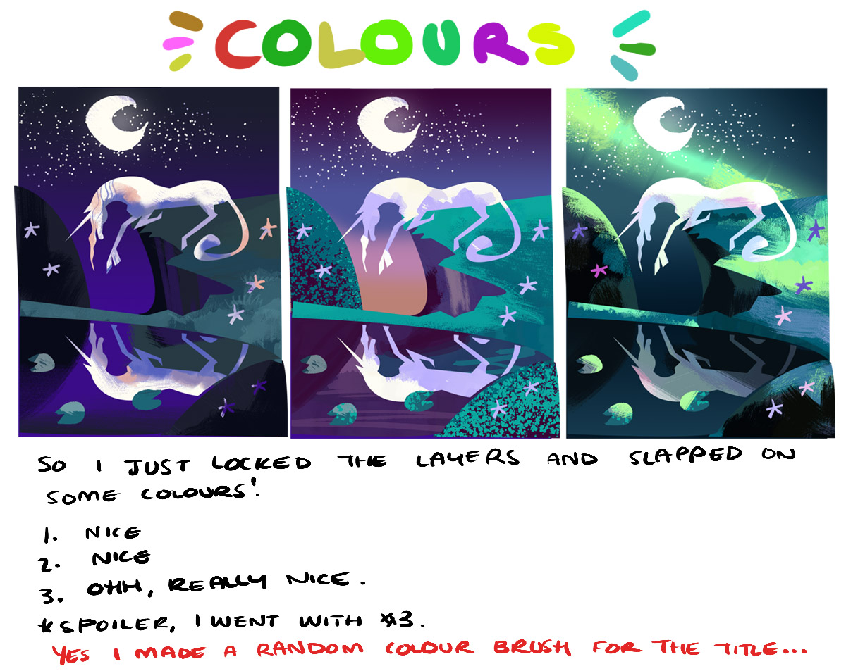
This is also not the end if you choose to go on! With layer settings, gradient maps and levels you can give your pattern a different vibe if you intend to reuse it. As you can see I played around and made a few variations and they give a different feel.

What is obsession you ask? Making a pattern to fit in this little slither of a wall.

If you enjoyed this walk-through and used it to make something I’d love to see it! Tag me in on it on Twitter or Instagram @chervellefryer

Where I live on the web:

Website: https://chervelle.co.uk
Twitter: https://twitter.com/chervellefryer 
Instagram: https://www.instagram.com/chervellefryer
Facebook: https://www.facebook.com/chervelleillustration

Sweden National Day – Misty Woods

Moose Woods
National Day of Sweden 6th June 2019

This was a little speed-paint that I did for National day of Sweden. It was more of an excuse to draw some woods and a lady moose. It’s a loose overall image with more of a feeling of atmosphere over anything else.

The only thing I knew I wanted this image to have was a forest of some sort. It’s based loosely on a section of forest I got lost in this Winter whilst looking for some old viking ruins. One thing I found a lot of whilst exploring woods and old places was these Stone Walls from old times. Another thing I found was that the trees rose so tall, and the earth was also heavy with moss and greenery. It truly feels like a place where magic can happen.

Doing things in a bit of a different order, these were the colour thumbnails which I composed to try and figure out how I wanted the image to feel. Overall I wanted it feel like there was some sort of mystery, like a troll could be creeping around or the air was heavy. Sweden has some sort of magic to it’s ancient forests, and it’s hard to capture it but you can definitely understand why there are so many mythological creatures and stories based in the forests.

And finally these were the original sketches I mocked up during fika. I do know for sure I was very tempted to paint up the cat in the flowers on the right page but didn’t really feel it was a good rendition of how I saw Sweden. Sweden to me is very vast and so rich in what it has to offer.

The Last Unicorn Walk-through

Hej välkommen!

This is hastily thrown together walk through of sorts on how I did my last unicorn piece. Here’s the painting video, however you can scroll through this blog post to see my thoughts and some of the behind the scenes work. Please excuse the poor photo’s, I moved country this year and I haven’t replaced all my office equipment yet. All I have is my phone, a tiny sketchbook and a few pens.

***********************

So onto the behind the scenes!

So these are the original idea of what I drew for the last unicorn. I watched the film twice and doodled as it ran through and tried to collect my thoughts on what I wanted to present. I was very literal in the beginning but then it occurred to me that I didn’t have to represent the whole film, I just had to try and put together how I felt about the film. Essentially, magical and ponies are a win for me.

Spoilers; I can’t draw for shit, but I can sure as heck paint.

I was also having a think about what I wanted Amalthea to look like. In the film it mentioned that she would look like a white mare to the unsuspecting eye, but this didn’t give me a whole lot of reference. After watching the film, it made sense if she was an Arab or Akhal-Teke horse type as they’re quite long and elegant.

Image result for akhal-teke
This was actually the horse I referenced and then exaggerated.

So after going through my poor excuse of etchings on paper, I picked these three idea’s and put them into black/white. The main point of this is to see if you can read what’s going on.
In the first, you get the sense of a horse all alone in a forest. (I will paint this up eventually!)
The second is a bit moodier/romantic.
And the last was the bull stepping back into the Ocean.

So my MIL actually kind of picked the one which I worked up by calling it pretty from the thumbnail. That’s pretty much all I needed to pick number 2. So I used the lasso and quickly chucked on the basic shapes. Yes, these were the exact colours I just chucked down at first.

Next is picking colours, I always get super torn on this. I knew I wanted a night scene as there’s a moon but that was about it. I threw down some colours which sorta fit. So a more blue traditional scene, a magical dusky thing, and then GREEN. Because I always take the opportunity to use green. My husband chose the last colour scheme as I was pretty conflicted.

Below are some screenshots from the original file, which I remembered to take. I kinda forgot tbh. The first thing I did was elongate the scene as it felt like it had more of an impact.

So this was the image stretched out, and roughed in. I think the file size was 8000px wide or something silly.

Roughed in shapes again, this time with the pen tool, some nicer brushes but equally hideous colours.

Chucked down the neutral base colours.

And bam, the end! I honestly forgot to take screenshots throughout the piece.

And I guess that’s all! Obviously client pieces are a bit more complex, more levels of character development etc. But for personal pieces, and stuff I do for fun it’s just about not thinking as intensely 🙂

Where I live on the web:

Website: https://chervelle.co.uk
Twitter: https://twitter.com/chervellefryer
Instagram: https://www.instagram.com/chervellefryer
Facebook: https://www.facebook.com/chervelleillustration