

Hej välkommen!
This is hastily thrown together walk through of sorts on how I did my last unicorn piece. Here’s the painting video, however you can scroll through this blog post to see my thoughts and some of the behind the scenes work. Please excuse the poor photo’s, I moved country this year and I haven’t replaced all my office equipment yet. All I have is my phone, a tiny sketchbook and a few pens.
***********************
So onto the behind the scenes!

So these are the original idea of what I drew for the last unicorn. I watched the film twice and doodled as it ran through and tried to collect my thoughts on what I wanted to present. I was very literal in the beginning but then it occurred to me that I didn’t have to represent the whole film, I just had to try and put together how I felt about the film. Essentially, magical and ponies are a win for me.
Spoilers; I can’t draw for shit, but I can sure as heck paint.

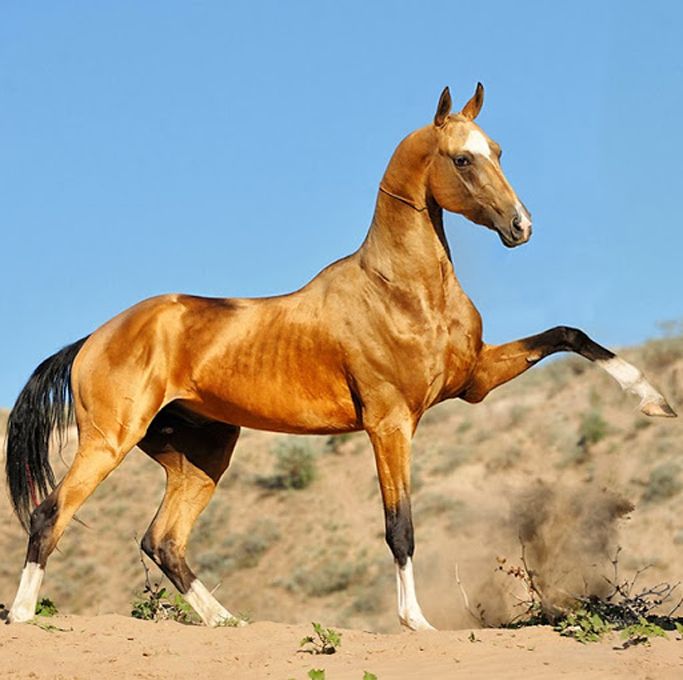
I was also having a think about what I wanted Amalthea to look like. In the film it mentioned that she would look like a white mare to the unsuspecting eye, but this didn’t give me a whole lot of reference. After watching the film, it made sense if she was an Arab or Akhal-Teke horse type as they’re quite long and elegant.

So after going through my poor excuse of etchings on paper, I picked these three idea’s and put them into black/white. The main point of this is to see if you can read what’s going on.
In the first, you get the sense of a horse all alone in a forest. (I will paint this up eventually!)
The second is a bit moodier/romantic.
And the last was the bull stepping back into the Ocean.

So my MIL actually kind of picked the one which I worked up by calling it pretty from the thumbnail. That’s pretty much all I needed to pick number 2. So I used the lasso and quickly chucked on the basic shapes. Yes, these were the exact colours I just chucked down at first.

Next is picking colours, I always get super torn on this. I knew I wanted a night scene as there’s a moon but that was about it. I threw down some colours which sorta fit. So a more blue traditional scene, a magical dusky thing, and then GREEN. Because I always take the opportunity to use green. My husband chose the last colour scheme as I was pretty conflicted.
Below are some screenshots from the original file, which I remembered to take. I kinda forgot tbh. The first thing I did was elongate the scene as it felt like it had more of an impact.

So this was the image stretched out, and roughed in. I think the file size was 8000px wide or something silly.

Roughed in shapes again, this time with the pen tool, some nicer brushes but equally hideous colours.

Chucked down the neutral base colours.

And bam, the end! I honestly forgot to take screenshots throughout the piece.
And I guess that’s all! Obviously client pieces are a bit more complex, more levels of character development etc. But for personal pieces, and stuff I do for fun it’s just about not thinking as intensely 🙂
Where I live on the web:
Website: https://chervelle.co.uk
Twitter: https://twitter.com/chervellefryer
Instagram: https://www.instagram.com/chervellefryer
Facebook: https://www.facebook.com/chervelleillustration
